Then choose your favorite photograph, save it and identify the two colors and where they are on the color wheel.
Go to color.adobe.com and upload your favorite photo to the website. It will show you all of the colors in the image and where they are on the color wheel.
Then tell me what you learned about this photograph and the color wheel and whether or not it inspired you to create your 2nd Complementary Color photo.
Since we will want our complementary colors to shine through, we will need to adjust the color levels in our two photos. Today’s warm up shows you how to do just that. Fire up Lightroom and try out a few for yourself.
Start the pre-production process of researching colors and how different photographers use complementary colors. Save your favorite images to your visual journal.
Using Adobe Color, I can see which colors are complimentary (reside on opposite ends of the color wheel)
For this week’s photo challenge, we will be making TWO photographs that explore both ends of the color wheel. If we use Adobe Color, we can easily see which colors are complementary. By going into Adobe Lightroom, and going to the color panel, you can control the individual levels of each color to make it more complimentary.
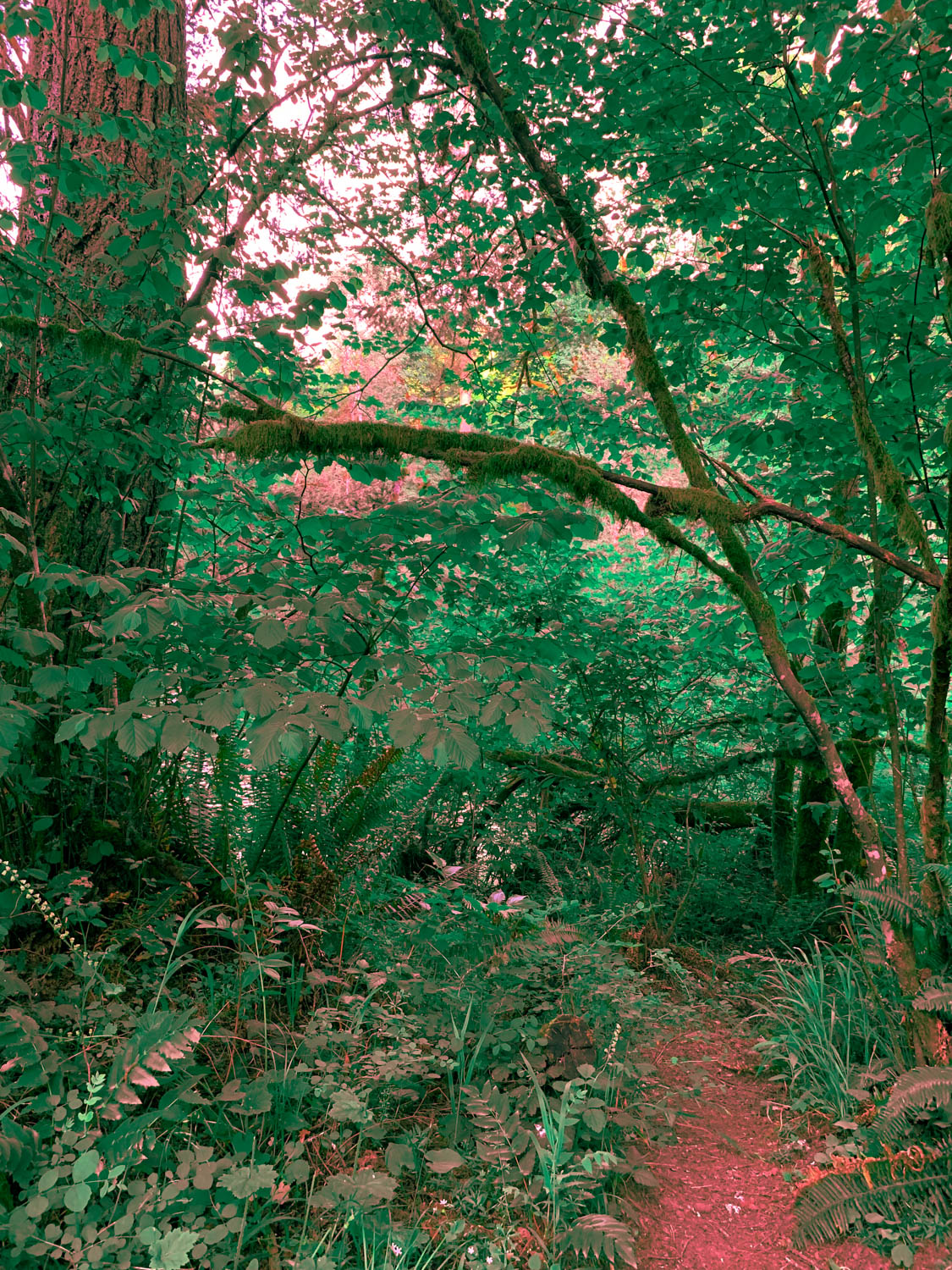
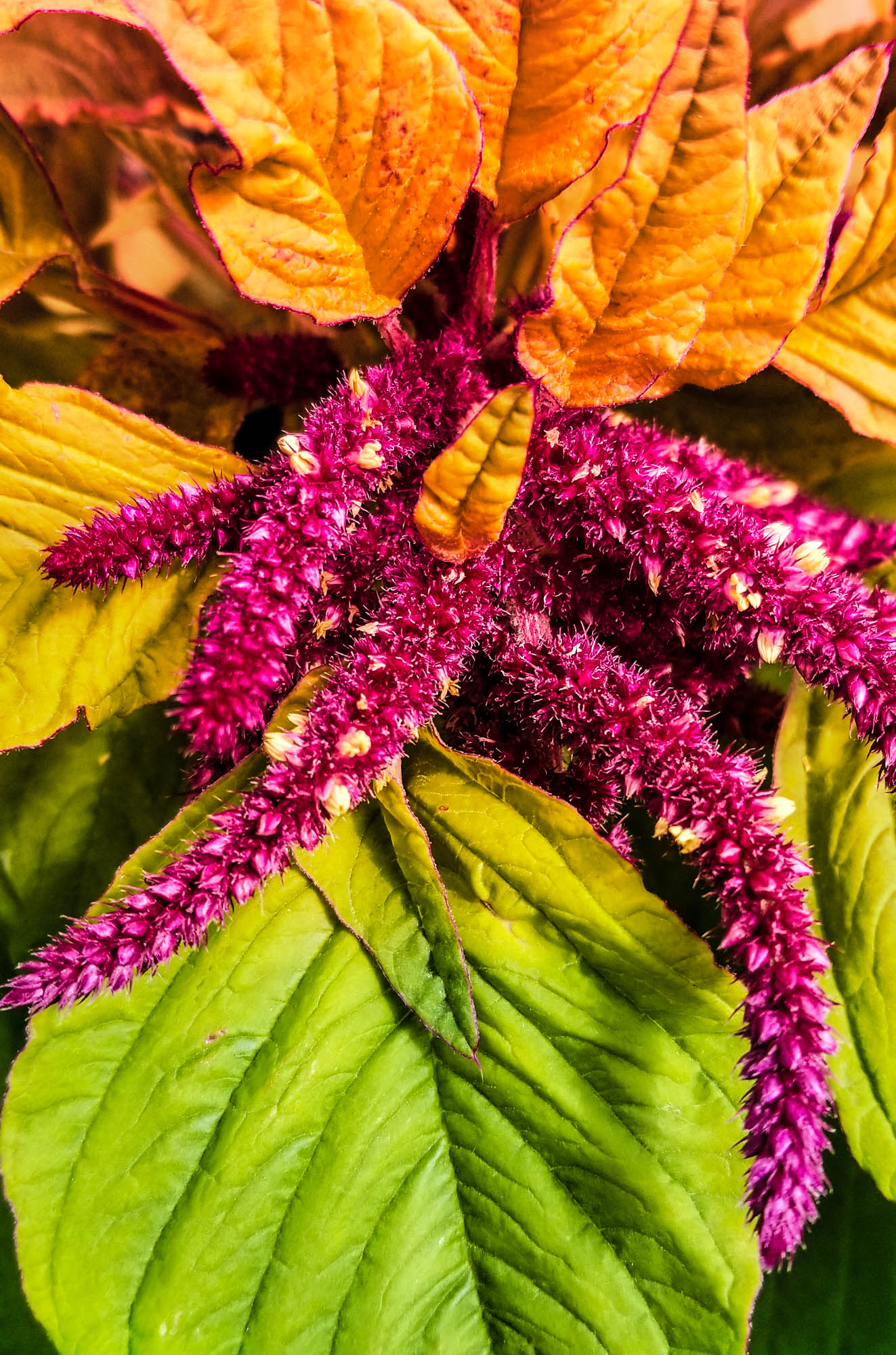
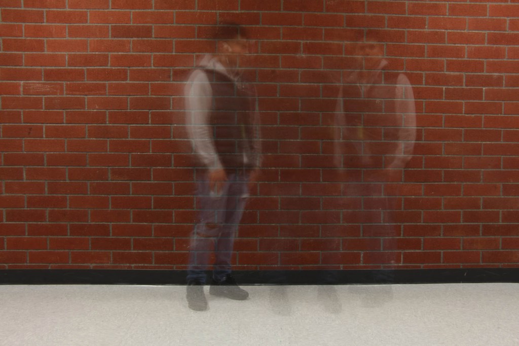
Red & Green are at Opposite Ends of the Color Wheel. I adjusted the colors in Adobe Lightroom to assure that they were on opposite ends of the color wheel . Photo by Adam StrongSame thing with brown and cyan. The above shot was taken with an infrared filter early one late spring morning here at HHS.Another option is to use a gradient map. A layer that has a blend of two complementary colors. I made two and can choose between either the sand or cyan, or the red and green. Note I have the blend mode set to overlay.
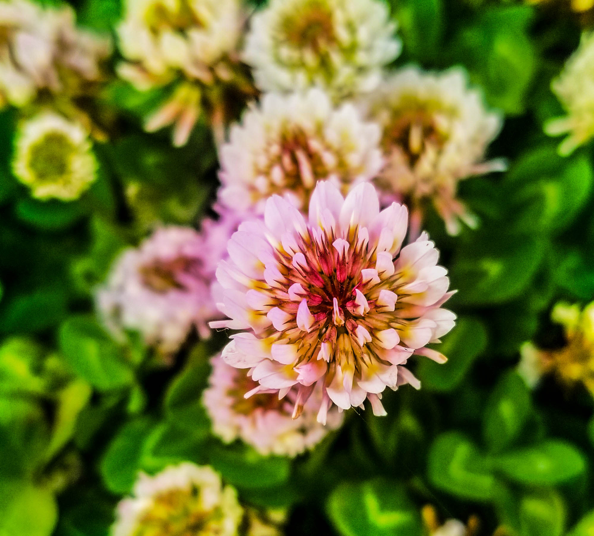
Student Examples:
How Color can Affect Emotion
Image Courtesy: Nofilmschool.com
Two images that demonstrate Complementary Colors are due before 3.13
How well you incorporate concepts of Color Psychology into your images.
The ideas your image present. How well the complementary colors are enhanced in Lightroom or Photoshop.
How well you capture two specific emotions using the color wheel.
Pre Production – Research
Research different ways photographers have used complementary colors in their photography. Find inspiration photos and include them on your visual journal. Choose a background, like a wall,field of grass, then choose a subject that has a color complementary to that background. You can test the colors using the Adobe Color color wheel.
Production – Shooting & Editing
Shoot your two sketches. Shoot from different angles, ask yourself where you want the complementary colors to go. Will they be in the original images, or will you add the colors later?
Post Production – Reflection
Write a reflection based on your experiences making these photos. Include all reflections, sketches and inspiration photos in your visual journal.
Two images that demonstrate Complementary Colors are due before 3.13
For today’s Warm up, we’ll be learning about Complementary Colors and how you can deliberately choose images that have complementary colors. This week’s photo challenge will be around complementary colors.
After reading the article, answer the following questions in your visual journal.
Which pair of complementary colors are you most familiar with? Why is this so?
What is the difference between analogous and complementary colors?
How would you go about making a photograph with a complementary color pair?
How would you go about making a photograph with all of the complementary color pairs?
Choose your favorite image from the article and download it.